YARD
An unique, luxurious brand identity for Yard: Yoga & Pilates Studio
00

problem
Most yoga and pilates studios look the same, soft beige tones, muted visuals, and the familiar “calm wellness” vibe. Yard wanted to break away from this sameness and show a stronger, more distinctive identity.
solution
We created a bold, modern brand identity that replaces beige minimalism with graphic energy and a unique color system. The result is a fresh, confident look that stands out in a crowded market while still capturing the balance and movement at the core of Yard.
Brand strategy
We started with the brand strategy, defining Yard’s personality as grounded, confident, and dynamic—far from the typical soft wellness aesthetic. The target audience became modern, active individuals who value movement, quality, and a more elevated studio experience.
Visual Identity
From there, the visual identity took shape: a logo symbolizing flow and movement, paired with a calm purple-blue palette that feels refreshing, premium, and unmistakably Yard.
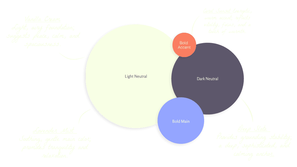
> Colour palette Yard
Brand in Use Design
We developed a brand look that truly resonates with Yard’s audience, knowing that consistency builds trust and keeps people coming back. To support that, we created a range of cohesive brand assets: social media designs, merchandise, website layouts, and business cards, all aligned with Yard’s visual language. This ensures Yard can show up everywhere with the same strong, recognizable identity.
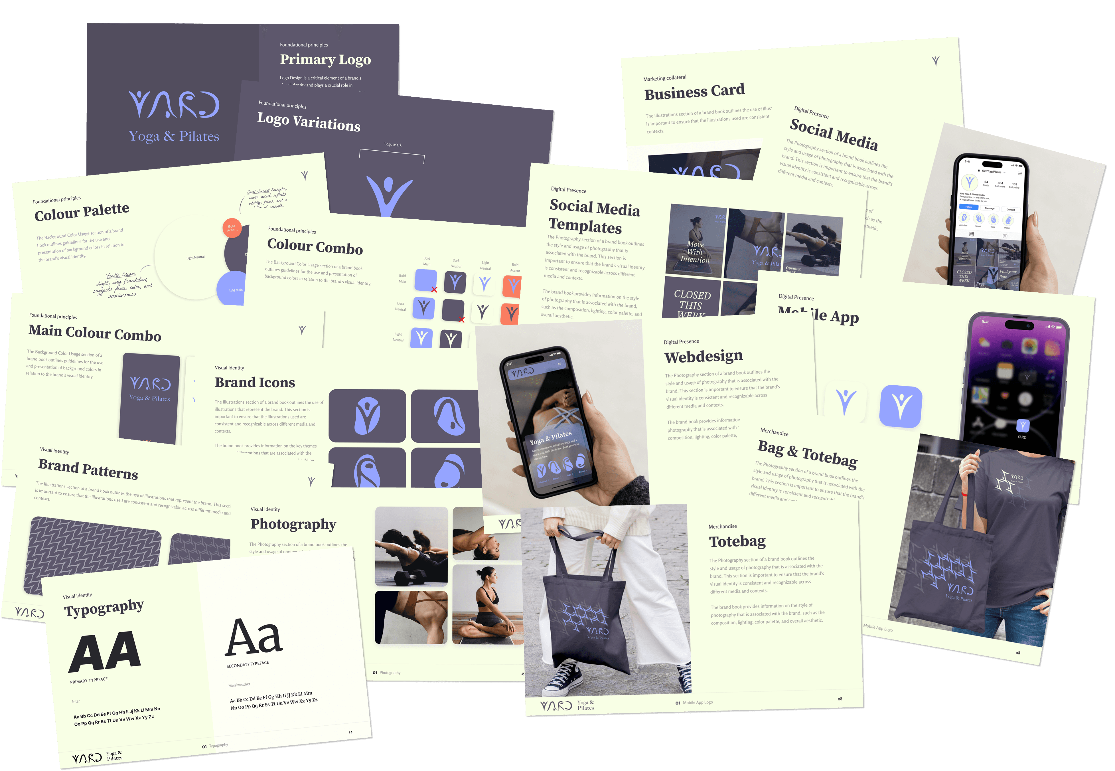
> Brand guideline deck
01

Brand in Use Asset, Social Media Design & 6 Templates
02

Brand in Use Asset, unqiue merchendise design
03

Brand in use asset, Webdesign
✦
see also


