CHEEKY
A bold, confident, fun and cheeky brand identity for 'Cheeky': The coolest fiber supplement.
00

problem
Wellness often feels restrictive, boring, and guilt-driven, especially when it comes to gut health supplements. Consumers are forced to choose between science-backed efficacy and true enjoyment, making daily fiber care a forgettable, joyless routine.
solution
Cheeky eliminates the compromise by blending clinical ingredients with a bold, playful energy. We offer tasty, feel-good fiber that makes daily gut care effortless, redefining wellness to be confident, cool, and irresistibly fun.
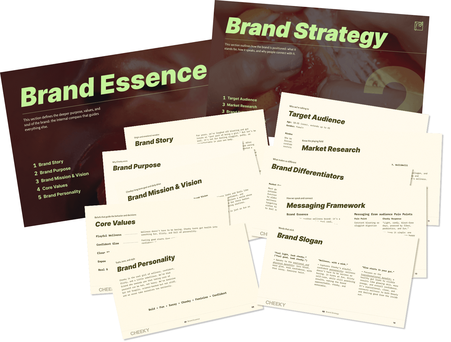
1. Brand Strategy
We started with the brand strategy, defining Cheeky’s personality as Playful, Confident, and Irresistibly Cool, a deliberate move away from the bland, clinical aesthetic typical of the supplement aisle. The target audience became modern women who seek effortless, science-backed wellness and believe that feeling good should be just as fun as looking good. The mission was clear: to redefine gut health by making it the hottest habit around.
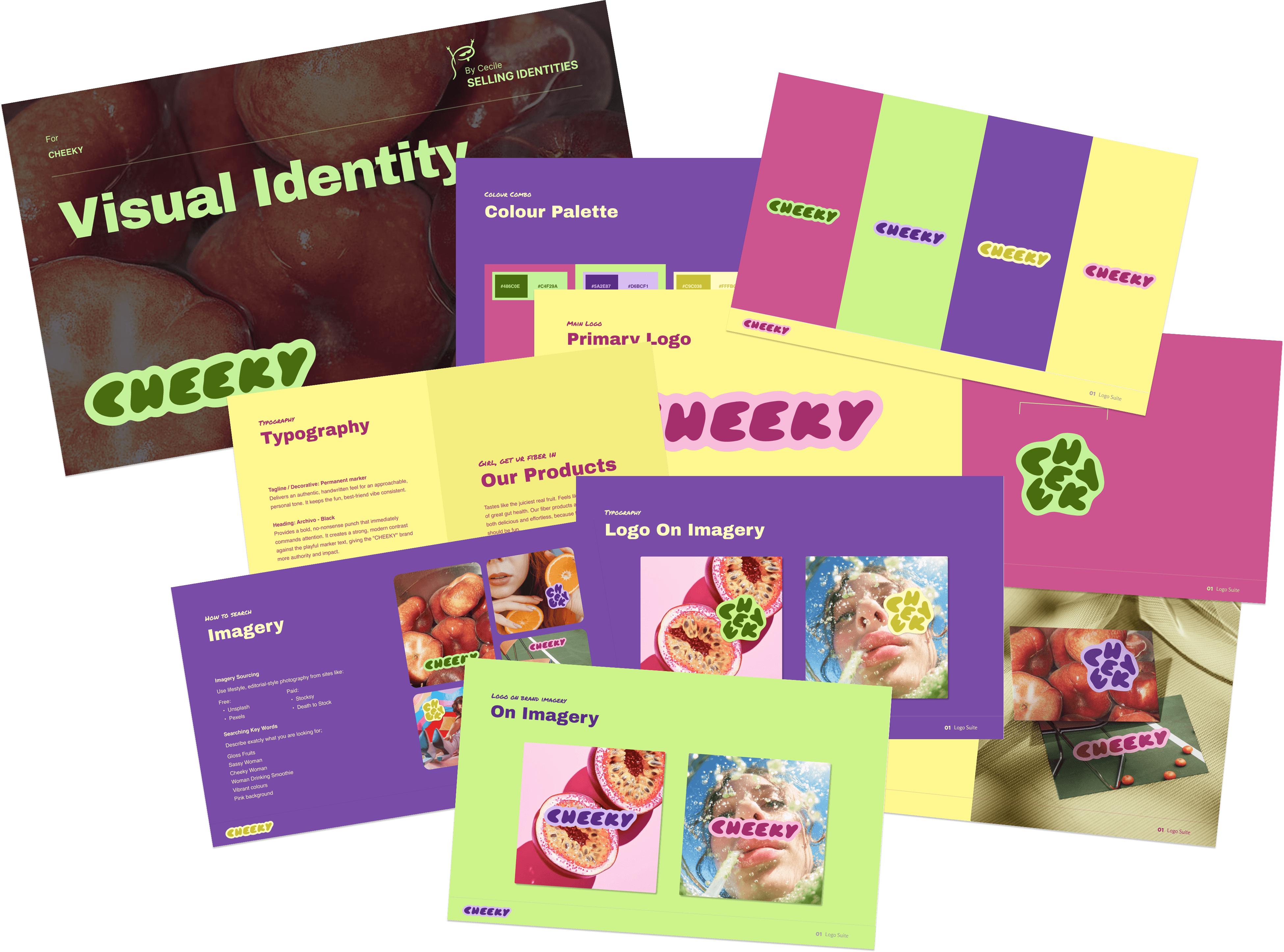
2. Visual Identity
From this foundation, the visual identity took shape: a chunky, retro-inspired logo symbolizing the boldness and 'cheeky' energy of the brand, paired with a vibrant, high-contrast Fruity Pop color palette. This combination featuring saturated purples, neon limes, and hot pinks, feels energetic, tasty, and instantly recognizable as the joyful, guilt-free side of wellness.
✦
see also


